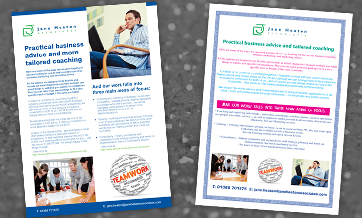
Same content, different result. OK, let’s be honest, we haven’t actually seen anything quite like the one on the right (well, at least for a few years anyway). We made it up – using all the deadly sins of design we could think of.
Ever wonder why something you see just doesn’t look right – but you can’t quite put your finger on why?
- Too many colours and fonts
- Amateurish styling
- No thought to layout or composition
- Poor positioning of images
- No cohesive colour theme
Each one of these degrades the final result. A combination of two or more and your piece is in real trouble. Don’t let it happen to you!